Jetpack Compose Ep:9 — Progress Indicator App
Here we will see about Progress Indicator and its types with respect to their attributes.

To get your basic done, do visit to my previous articles which are given below:
- Jetpack Compose Episode:1 — Just Text App
- Jetpack Compose Episode:2 — The Scroll App
- Jetpack Compose Episode:3 — Button App
- Jetpack Compose Episode:4 — Icon & Icon Toggle Button App
- Jetpack Compose Episode:5 — Divider App
- Jetpack Compose Episode:6 — Floating Action Button App
- Jetpack Compose Episode:7 — Extended Floating Action ButtonApp
- Jetpack Compose Episode:8 — Radio Button App
Note: In build.gradle(Project Level) file, the compose_version is upgraded to ‘1.0.0-beta01’ and maven() is replaced with mavenCentral(). Also the dependency is upgraded to classpath “com.android.tools.build:gradle:7.0.0-alpha08”
classpath “org.jetbrains.kotlin:kotlin-gradle-plugin:1.4.30”And in build.gradle(Module Level) file, following dependency is upgraded:
implementation ‘com.google.android.material:material:1.3.0’
implementation ‘androidx.activity:activity-compose:1.3.0-alpha03’
Progress Indicator
Progress Indicator is a component which tells user about the current ongoing process such as downloading, processing, verifying, etc.
In Jetpack Compose, there are two types of Progress Indicators and they are as follows:
Circular Progress Indicator
It is also known as Determinate Circular Progress Indicator. It represents the progress by drawing an arc. The arc ranges from 0 to 360 degrees. It doesn’t contain any kind of default animation. To add some animations on it, we can use ProgressIndicatorDefaults.ProgressAnimationSpec. It is a default animation recommend for it.
Attributes of Circular Progress Indicator
- progress — it is used to represent the ongoing progress by ranging from 0.0(no progress) to 1.0(full progress).
Note: values gets forcefully obtained if they are outside of the given range.
- modifier — it is used to provide modifications by means of padding, fill size, etc.
- color — it is used to color the progress indicator
- strokeWidth — it is used to provide stroke to its width
Linear Progress Indicator
It is also known as Determinate Linear Progress Indicator. It represents the progress by drawing an horizontal shaped straight line. It doesn’t contain any kind of default animation. To add some animations on it, we can use ProgressIndicatorDefaults.ProgressAnimationSpec. It is a default animation recommend for it.
Attributes of Linear Progress Indicator
There is only one change in the Linear Progress Indicator’s attribute and that is as follows:
- backgroundColor — The background color stay visible only unitl the progress of the Linear Progress Indicator gets completed(reaches to very end).
Rest are same as Circular Progress Indicator’s attributes except strokeWidth is not available in Linear Progress Indicator.
Simple Circular Progress Indicator
@Composable
fun SimpleCircularProgressIndicator() {
    CircularProgressIndicator()
}
Featured Circular Progress Indicator
@Composable
fun FeaturedCircularProgressIndicator() {
    CircularProgressIndicator(
        progress = 0.8f,
        modifier = Modifier.padding(8.dp),
        color = Color.Green,
        strokeWidth = 2.dp
    )
}
Simple Linear Progress Indicator
@Composable
fun SimpleLinearProgressIndicator() {
    LinearProgressIndicator()
}
Featured Linear Progress Indicator
@Composable
fun FeaturesLinearProgressIndicator() {
    LinearProgressIndicator(
        progress = 0.2f,
        modifier = Modifier.padding(8.dp),
        color = Color.Green,
        backgroundColor = Color.Red
    )
}
Complete Code
package com.akshay.progressapp

import android.os.Bundle
import androidx.activity.compose.setContent
import androidx.appcompat.app.AppCompatActivity
import androidx.compose.foundation.layout.Arrangement
import androidx.compose.foundation.layout.Column
import androidx.compose.foundation.layout.fillMaxSize
import androidx.compose.foundation.layout.padding
import androidx.compose.material.CircularProgressIndicator
import androidx.compose.material.LinearProgressIndicator
import androidx.compose.runtime.Composable
import androidx.compose.ui.Alignment
import androidx.compose.ui.Modifier
import androidx.compose.ui.graphics.Color
import androidx.compose.ui.unit.dp
import com.akshay.progressapp.ui.theme.ProgressAppTheme

class MainActivity : AppCompatActivity() {
    override fun onCreate(savedInstanceState: Bundle?) {
        super.onCreate(savedInstanceState)
        setContent {
            ProgressAppTheme {
                Column(
                    verticalArrangement = Arrangement.SpaceEvenly,
                    horizontalAlignment = Alignment.CenterHorizontally,
                    modifier = Modifier.fillMaxSize()
                ) {
                    SimpleCircularProgressIndicator()
                    FeaturedCircularProgressIndicator()
                    SimpleLinearProgressIndicator()
                    FeaturesLinearProgressIndicator()
                }
            }
        }
    }
}

@Composable
fun SimpleCircularProgressIndicator() {
    CircularProgressIndicator()
}

@Composable
fun FeaturedCircularProgressIndicator() {
    CircularProgressIndicator(
        progress = 0.8f,
        modifier = Modifier.padding(8.dp),
        color = Color.Green,
        strokeWidth = 2.dp
    )
}

@Composable
fun SimpleLinearProgressIndicator() {
    LinearProgressIndicator()
}

@Composable
fun FeaturesLinearProgressIndicator() {
    LinearProgressIndicator(
        progress = 0.2f,
        modifier = Modifier.padding(8.dp),
        color = Color.Green,
        backgroundColor = Color.Red
    )
}
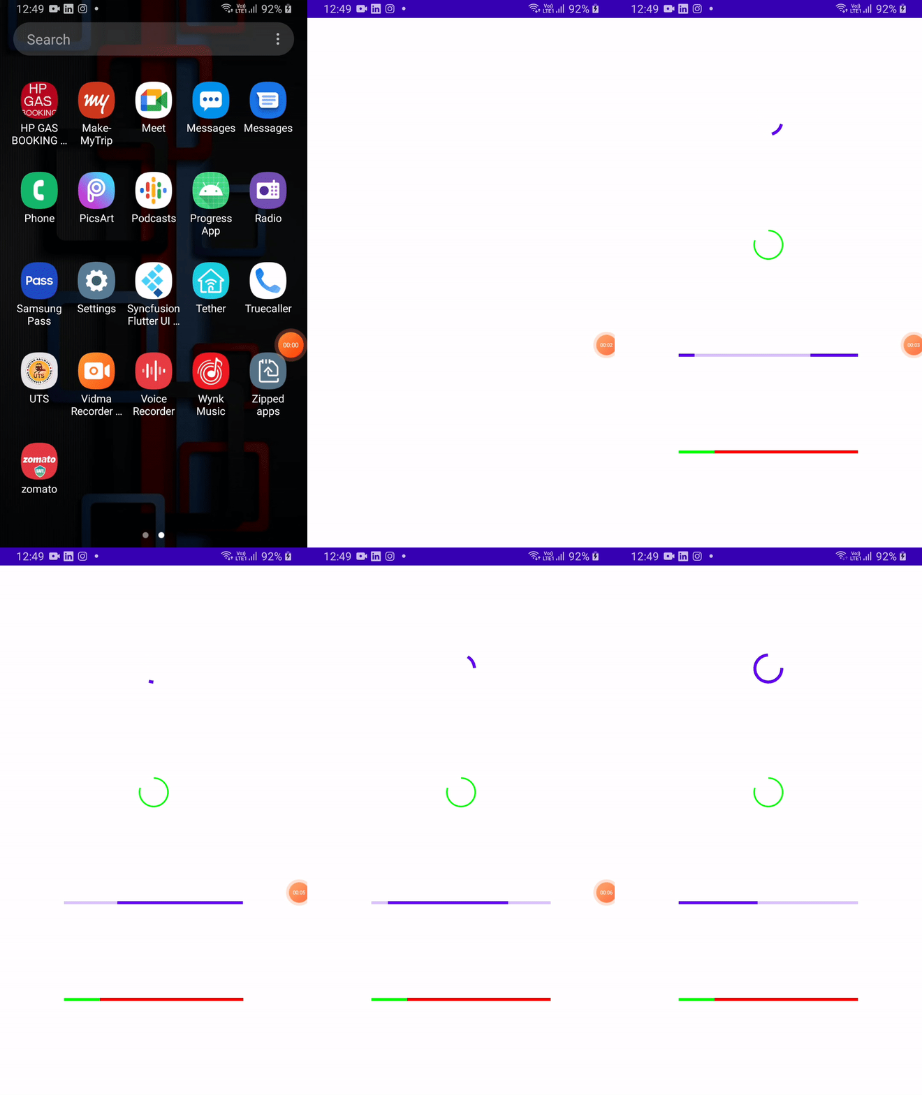
Output:

If there is any issue, do let me know in the comment section.
Connect with me on:
Thank you & Happy coding!

